Summary
As an animal lover, I’m constantly flooded by posts across social media on my handheld devices about pets from local shelters and rescues needing fosters or forever homes. It is only appropriate that people can browse databases for adoptable pets and apply to adopt on our handheld devices with the same ease. PawPrints gives organizations of all sizes an equal playing ground to reach potential adopters through the convenience of their handheld devices.
The Problem
Every day there are dogs and cats sitting in shelters and foster homes waiting for someone to come by and give them a permanent place to call home and a family to love for the rest of the life.
Standing beside these animals through this struggle are countless volunteers and organizations hoping to connect these animals to their humans, but the visibility of these organizations and the animals they are helping are not all equal. Browsing through individual sites can also get tedious, potential adopters lack a centralized place to store and organize information about the pets and their applications.
PawPrints is here to bring animals and their future families one step closer by giving all the animals a fair chance at being seen regardless of the size of their organization and streamlining the adoption process with the click of a button.
Solution
Each animal deserves a chance to shine in the spotlight regardless of the organization that is providing them temporary shelter.
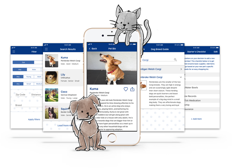
PawPrints will be a database for large shelters and small organizations to let users see an all inclusive list of adoptable pets that are currently available. While there are similar apps that currently exist, PawPrints has an additional feature where applications can be submitted and tracked from the app itself.
Research
To better understand what is currently available, I did some competitive research and analyzed the strength, weaknesses, opportunities, and threats of each service.

✔ Established over 20 years ago
✔ Intuitive Navigation
✔ Easily connects user to organization
✘ App lacks emotional pull
✘ Not widely promoted by partners
PetFinder prides itself in being an established pet adoption service, helping people find their new family member for over 20 years. Their mission is to give every adoptable pet in the United States, Canada, and Mexico a fair chance at escaping kill shelters and finding a loving home that will treat them like family rather than a possession. PetFinder's database of available pets is dependent on each registered organization’s diligent upkeep and regular updates as new pets are brought into their care and others are adopted.
One of the many strengths of the PetFinder mobile app is it’s intuitive user experience. The user is immediately shown a detailed search filter with the type of animal, breed, life stage, gender, and size of the animal can be selected. The call to actions are straightforward allowing easy navigation through the app. Once search results have been generated and a pet is selected to view, the pet description is clear cut and to the point with buttons at the bottom allowing easy contact to the specific organization holding the pet and a small note section. A weakness that the mobile app has is the lack of emotional connection. On the website, viewers are exposed to catch phrases that speak to the love and care an animal can add to a family, but in the app itself there is no space for the emotional pull. The visual aesthetics of the search results themselves only reveal the pet’s photo and name and looks like there is room for improvement in layout and content to simplify the visuals and make the user experience more efficient.
While the PetFinder website is fairly well known, the app itself isn’t as widely promoted. There is room for collaboration between rescues or shelters to promote the app for on the go searches. There are also a few other apps that are popping up with very similar search criteria and databases that could possibly pull users away from PetFinder.

✔ Indepth filter options
✔ Search results includes short summary of each pet
✘ Overwhelming amount on information in pet bio
✘ Service is limited to mobile apps only
The WeRescue app originally started as Woof back in 2014 as a dog specific adoption app and was changed in early 2017 to include a variety of species. Its database consists of adoptable pets from various organizations across the United States and Canada, which is maintained by the organizations themselves.
While the initial filter options are almost identical to PetFinder, switching to the advance search option tab will reveal an extensive list of filters available to premium members ranging from breed and medical history to temperament and specific environment needs. This is a strength of the WeRescue app to help users of all experience levels to consider specific needs that may or may not work with their living environment that they may not have thought of. The search results include the pet’s photo with its name, breed, gender, life stage, size, and distance right next to the image, allowing users to get a quick snapshot description of each individual pet. One weakness that was made with good intentions is the extremely detailed pet bio format. All fields that were available in the premium filter options are listed under each pet’s individual bios, easily overwhelming the user with massive amounts of text on one screen.
WeRescue is unfortunately not tied to a website like PetFinder, limiting it’s exposure to potential interested users. Like PetFinder, there is also room to collaborate with rescues and shelters to help build their user base. They are also competing with PetFinder with similar search areas and purpose.

✔ Whimsical aesthetic is unique
✔ Easily connects user to organization
✔ Allows users to submit application through the app
✘ Not widely known
✘ Service is limited to mobile apps only
Adopets has the smallest community base of the three competitors I researched, however, they took a slightly different approach than the previous two by implementing the actual adoption process into their app. The visual aesthetic of the app itself is more whimsical than PetFinder and WeRescue, giving it a charm that the other two apps lack. Unlike the previous two apps, Adopets does require users to sign up for an account in order to use the app to its fullest potential.
As mentioned prior, Adopets set itself apart from other animal adoption apps but integrating a generic application that can be saved in the user’s app and submitted for review by organizations managing the potential animal. They also allow the user to keep track of which animals were applied for. Not only can users submit and keep track of their applications, organizations can review them through the app and also collect down payment for the new pet. The individual pet bios are short and sweet with one section devoted to general information and the second with the organization’s contact information and call to action buttons to begin communication. One weakness that I believe Adopets couldn’t see was aligning the visual aspects across the app and website in efforts to make things more manageable and consistent.
Like PetFinder, Adopets also offers the options to search available animals from a website in addition to their app which expands their exposure. Adopets could easily collaborate with willing organizations to expand their customer base. The risk would be that users would lean towards PetFinder because of it’s existing reputation over Adopets. They also have very similar search filters which seem to work across the board for all three apps, but they are also incredibly repetitive across the various apps which could open up an opportunity to set themselves apart.
Process
I sent out a survey to individuals who have adopted or have been interested in adopting pets at some point in their lives to understand their thoughts and needs throughout their search. The results to my initial survey was probably the most surprising to me, but also in a good way. It was great to see how people all took their individual approaches to search for their pets, and through some of the interviews, how prepared or unprepared they felt when they took their new friend home. The survey quickly outlined the key problems that I wanted to address: too many options with unexpected availability, many organizations that were unknown, and the lack of a centralized place to organize all the necessary information.
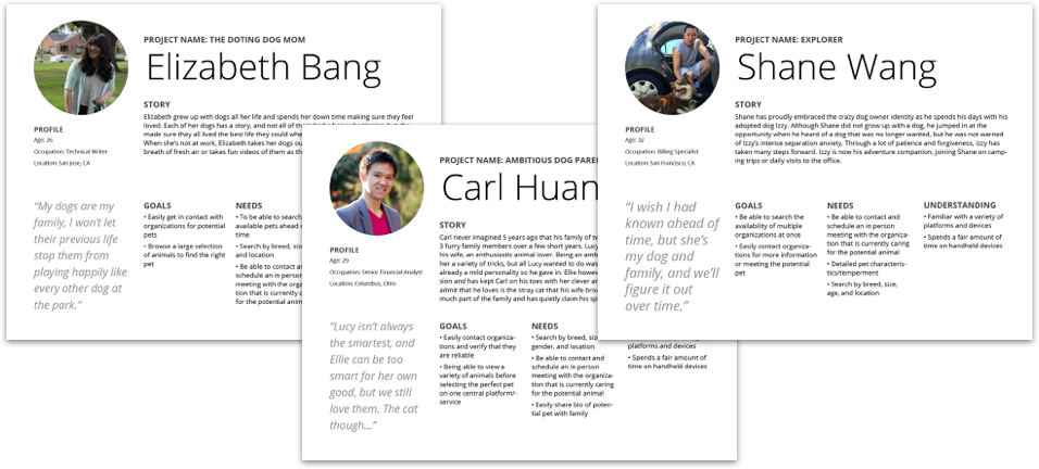
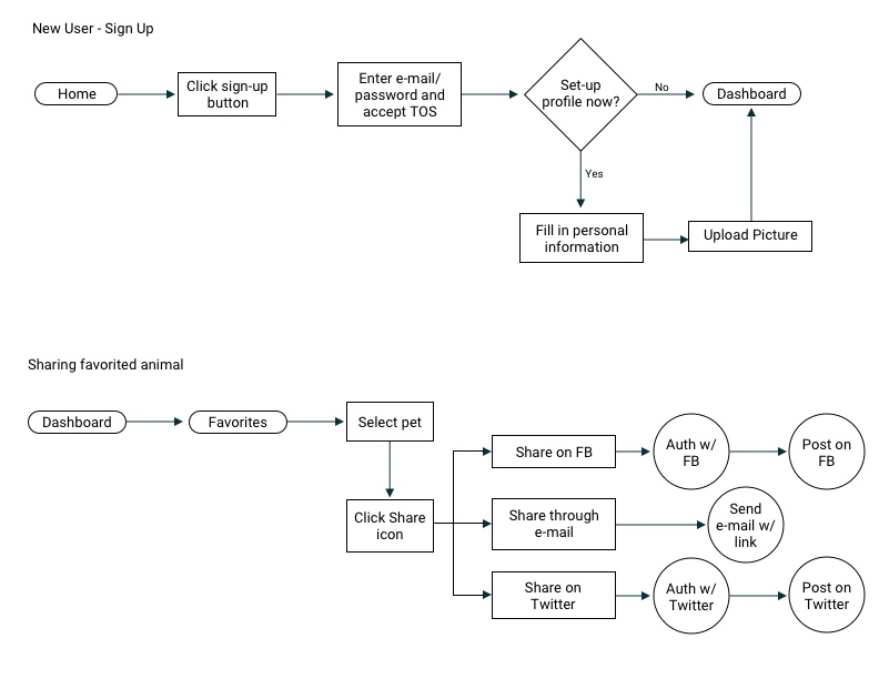
After compiling a list of user stories that a potential user would walk through, I drafted user flows to understand each step I would have to design into. I broke down each user flow to map out all options that a user would consider when searching for pets and the information they would need in order to complete each task. With the completed user flows, I built my site map to plan out the pages I will need to design into for the final product.

Logo
Before I could start my mockups, I needed to established the visual aspects of the brand: Logo, font, and color story. I started a mind mapping exercise to gather ideas through word association before I began sketching out potential designs.

When I started sketching the logo, I wanted to make sure that my design wasn’t too rigid and had a little personality. I wanted to make it something people could easily recognize but also charming. Utilizing negative space is something that I always enjoyed as a designer and was apparent through many of my sketches, giving the viewer just enough information and letting their minds fill in the rest. I went through a few iterations before I settled on my final logo that I wanted to move forward with.
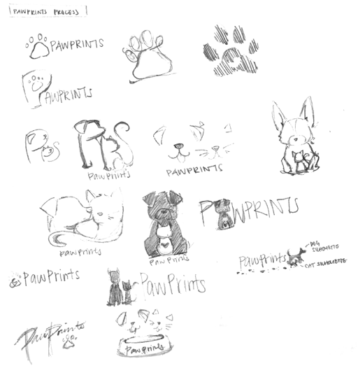
The final design was a blend of a dog and cat's face with a play on the letters. Every pet has their own unique personality, and it was only fitting that the logo would reflect a unique whimsical charm.


