Summary
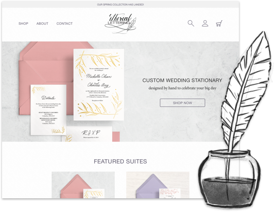
Wedding planning is often described as a stressful process, but Ethereal Lettering has made its purpose to provide engaged couples and wedding planners a one-stop shop to all their wedding day stationery needs. As a small business, the designer is able to interact personally with each customer to finalize details and ensure that the end product is in line with the customer’s vision. Ethereal Lettering is here to bless each couple and start off their exciting new journey stress free.
The Problem
The number of small businesses in the wedding stationary industry is growing, but many of the designers either design completely from scratch for each order or have a small variety of fixed designs for users to choose from.
Many of them also focus solely on invitations, giving customers the challenge of finding additional stationary like menus or thank you cards to match.
Solution
By giving curated options in addition to individual products, customers will be able find stationary to fit every budget. The customer can then purchase wedding day stationary like menus and thank you cards that align with their chosen invitation design to complete their big day.
Research
To better understand what the market is like, I did some competitive research and analyzed the strength, weaknesses, opportunities, and threats of each service.
✔ Established over 20 years ago
✔ Intuitive Navigation
✔ Eye-catching curated collections
✘ Color palette on site can be difficult to read
✘ Limited color selection
✘ Must purchase entire curated collection
Linen and Leaf is a small event stationary brand by calligraphy artist Katie Roden. She started as a calligraphy artist and later pursued wedding paper design as her primary work. The brand has a very simple aesthetic, with clean wedding invitation suites and a muted neutral grey palette for her website and social media, allowing her calligraphy script to shine through. Her customers are couples-to-be looking for charming stationary for their big day, but her craft is widely appreciated by many calligraphy artists across social media.
The imagery on the landing page immediately draws the viewer to the craft and detail that goes into the stationary, featuring a close up of one of her curated collections. The first image clearly tells the customer that the site is focused on wedding paper designs. Below the hero image are five curated packages featuring different aesthetics for the customers to select and then customize with their own content and monograms. Once a package is selected, the customer is given the option to choose the various types of stationary they’ll need (save the dates, invitation suite, detail add-ons, etc.) to further personalize their stationary. All product photos across the site are beautifully staged and consistent with the sophisticated aesthetic of the brand. The overall navigation is pretty straightforward throughout the site.
While the grey color palette on the site is appropriately chosen and applied, some of the text becomes incredibly difficult to read. The text at the top featuring newly added product and the text placed over images are barely visible, making it easy to miss content or a strain to read certain content. As for the actual shopping experience, the customers aren’t able to select their color choices for ink, envelopes, paper on the actual product page. After a little digging in the add-on page, the customer will find that there are actually only four muted tones for envelopes to choose from, limiting the customer’s ability to match their invitations to their wedding colors. The calls-to-action are a little confusing because it is unclear whether these personalization options needed to be communicated through e-mail, a form, or selected elsewhere on the site.
As social media grows, more and more calligraphy artists are taking on the challenge of stepping into the world of event invitation design. Linen and Leaf has a consistent brand image and message throughout all of its channels, establishing it as a well-developed brand. However, the limitations in color, cost, and minimums give their competitors some ground to stand on. The charm in Linen and Leaf that stands out from other companies is the detail in craft that comes with letterpress and timeless designs, and they are definitely capitalizing in those two unique factors to set themselves apart.
✔ Custom invitations designed by hand
✔ Whimsical watercolor illustrations
✘ No visibility to price until a quote is requested
✘ Style is not as refined
Viewers are greeted with color and personality the second they open the landing page and is clearly told that her primary product is wedding stationary. ElisaAnne uses a more feminine color palette with soft pinks and grey with pops of color in the imagery.
Unlike most e-commerce shops, ElisaAnne focuses on the personalized experience for her wedding invitations and her actual e-commerce shop houses mostly add-ons and additional resources. This is both a strength and a weakness for the company. Customers won’t have a basic understanding of what they are stepping into in regards to cost, materials, and style initially on the site until they request a copy of her pricing guide and request a quote. However, for the couple-to-be with very specific needs in mind, ElisaAnne could be a great option for them. In looking at the portfolio page, it is clear that watercolor is a strength of hers, but her work doesn’t look as refined as many of her competitors which could narrow her customer base.
The aesthetic of the website is consistent throughout the site, and the use of color helps accentuate the hierarchy on her site and calls-to-actions. Navigation across the site is fairly smooth, but the top menu navigation can be a little confusing the first time around. Some of the links lead to actual webpages while others activate a drop down menu for you to select from. An example would be that the “Portfolio” link brings the viewer to a page with examples of her previous work and images pulled from social media, but when you click the next link “Offerings”, you get a drop down menu that has you choose from three different categories that each lead to an individual landing page.
The inability to see what exactly what’s available and the potential cost at first glance can turn customers away because it would require them extra steps to get information that exists but is not visible on the site. ElisaAnne’s strength is that every order she makes is unique, but it can be hard to maintain a unique and personal design aesthetic when customers are given full reign, a challenge and opportunity. The calligraphy market is growing quickly as the trade becomes more accessible, making the experience easier for the customer would add to her unique artistic talent.

✔ A wide variety of designs to choose from
✔ Customizable options for some designs
✔ Prices are much more affordable compared to small businesses
✘ Individual designers lose recognition
✘ Service is limited to mobile apps only
While Minted is definitely not a small business, it is a huge competitor in the minds or couples-to-be because of the vast options that are becoming similar to the individual artists in the market. The amount of product categories on Minted is extremely broad so I narrowed it down to their wedding invitation selection.
The site for Minted is built to allow the product to shine and allow the easiest experience for customers. Filters are extremely detailed and also showcase the variety of options available. Minted offers the service of getting a dedicated Minted designer to help customize wedding invitations at a fraction of the cost of small businesses, bringing more challenges to small businesses. Some of their product images are animated on the product pages to help the customer understand the texture built into the product. Customers are able to make further decisions on color, font, material, and add-ons to make a complete package. Prices are immediately reflected with each design change and add-on, allowing the customer to know exactly what they’re working with. Navigation is straightforward for the user and calls-to-action are extremely obvious.
Minted is able to create a better platform for individual designers to show their product to a wider audience, but much like Etsy, the individual designers aren’t able to tell their full brand story. It’s easy to glaze over the designer’s short introduction at the bottom of the product page, and viewing the designer’s shop on Minted will bring up their entire product assortment, not limited to their wedding stationary selection. This could be an area of improvement, allowing users to shop wedding stationary by designer.
The ease in creating personalized stationary for reduced cost is appealing to many, but the designer’s story, aesthetic, and relationship built through each order is lost. Minted also carries a huge variety of product which is catered towards their large market, but having so many options makes it hard to actually understand and appreciate each design.
Process
I sent out an intial survey to participants that shopped online for event stationary and have shopped small businesses. The purpose of the survey was to better understand how potential customers of an event stationary e-commerce site run by a small business would prefer to shop and what they expected to see. Of the participants, 75% were within the age range of 26 to 30 years old and 25% were between 31 to 35 years old. A large part of the survey was focused on how the participants connected to a brand and the information they look for in their shopping experience.
When asked about what is important to them about a brand, 91% of the participants selected “reputation”, followed by 41% of the participants who chose a brand’s background story and manufacturing process as important factors. Some common responses as to why these things were important were their values on the quality of product, consistency, and understanding the company’s passion. On a scale of 1 to 5, with 5 being “extremely important”, 66% of the participants felt that product reviews were extremely important in understanding that they were getting quality product. The participants were slightly less opinionated when asked about transparency in cost, with only 41% stating the information as extremely important. Some felt that understanding the value of material and breaking down the numbers showed them the core motivation and heart of the attitude. It would make them more likely to purchase an item where they understood the quality and craft. Others who felt like transparency was not important see the product at face value and make their decision accordingly. Another important aspect that I wanted to touch on was to understand how people stay connected to the brand along with which social media platforms could I incorporate into the e-commerce site for more content and visibility. The most preferred platform by 91% of the participants was Instagram because of how easy it is to visually see product and aesthetic. E-mail lists were a close second and were selected by 75% of the participants. Two participants in particular mentioned how it is easier to filter e-mails and it is a familiar platform that they use everyday.
The last few questions on the survey were specific to the shopping functions like filters and how product assortment would be displayed. Seventy-five percent of the participants preferred having a filter even if there were a limited variety of products. Of all the questions, the responses for how they preferred color assortment to be displayed were the least polarizing. Half of the participants preferred having one color of the product image on the shop page and color options displayed on the product specific page while 41% wanted to see individual product shots of every color option available at first glance. The one response that differed was a blend of the two, having a shot of all the color options laid out in one image and individual shots on the product page to show each option. For event stationary specifically, 83% of the participants preferred having a mix of curated sets and individual pieces to customize their selection. They felt like curated sets clearly dictate the aesthetic and resonate stronger visually, but being able to pick and choose gives them a little more flexibility to their needs.
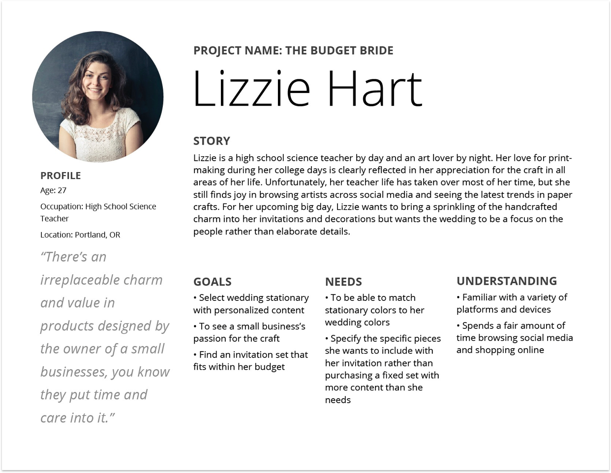
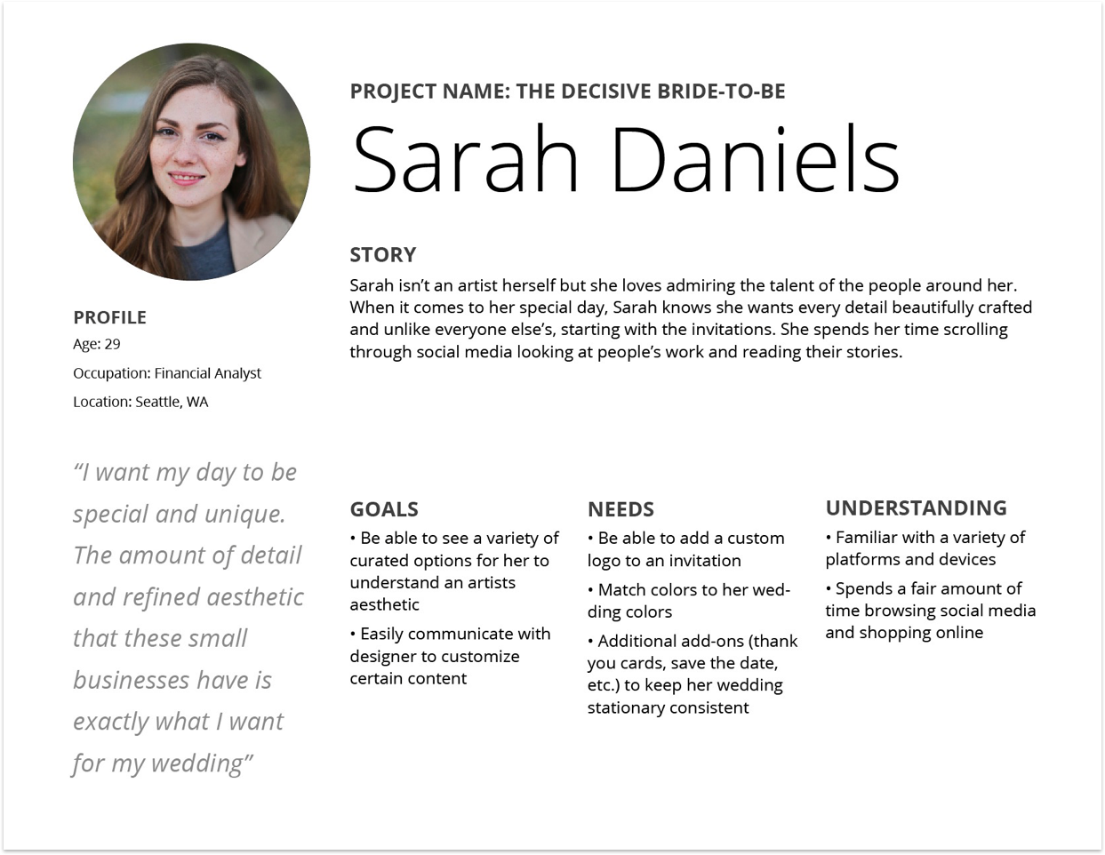
With these results, I created three user personas for Ethereal Lettering. There are two different groups of potential users: newly engaged individuals and wedding planners. Both groups would walk through the same process as they navigate their way through the site.
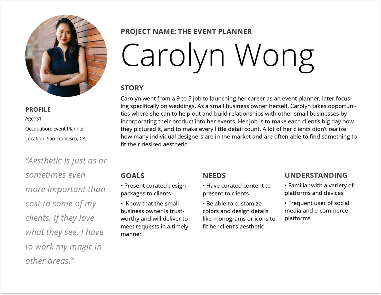
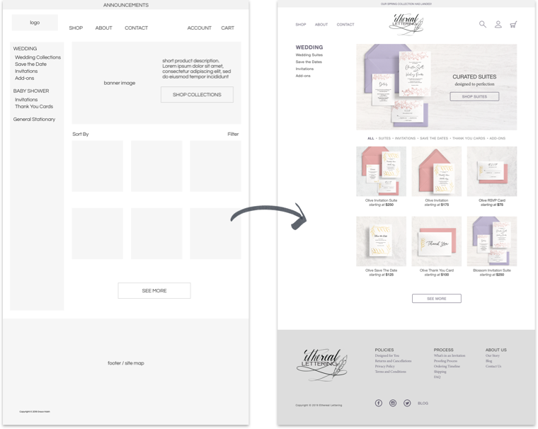
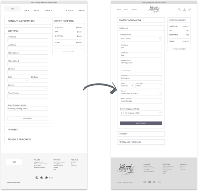
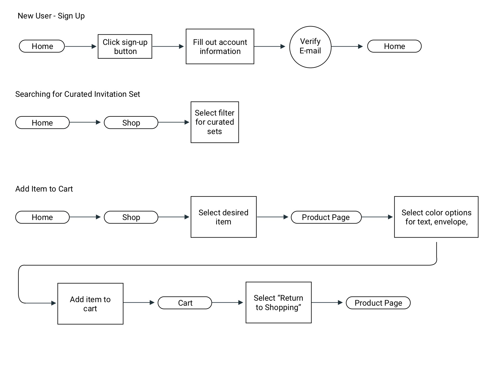
I chose a few key user stories and mapped out user flows to begin plotting out the wireframes I would need to draft. As I was creating the user flows, I was able to break down the various steps a user would require to complete each task along with additional options I should provide as a standard e-commerce shop.
Logo
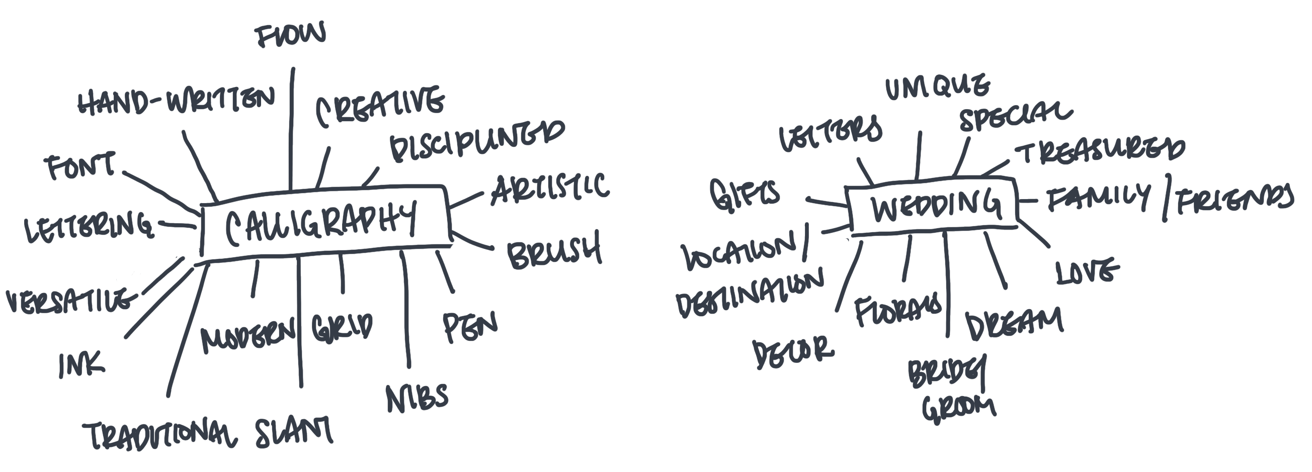
The next step was establishing the visual aspects of the brand: Logo, font, and color story. I started brainstorming with a mind-mapping exercise followed by rough sketches before working out the final logo.
I wanted to focus on the core of Ethereal Lettering for the logo, the calligrapher and designer behind the brand. As a calligraphy artist, Amanda’s most important tools were her pens and nibs because they dictated the line quality for everything she wrote. I wanted to incorporate her hand lettering with an icon that was novel and easily recognizable.
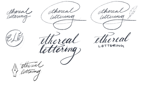
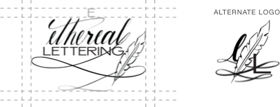
The final design combines handwritten calligrphy and a clean font with an illustrated icon to reflect the product Ethereal Lettering will produce.
